.png)
Picking out paint colors is probably one of the most fun yet crucial parts of decorating your space. The colors you choose will set the tone for the entire look and feel you’re going for. While it’s certainly exciting to look at paint swatches online or on a piece of paper, you’re often left stumped on how you can incorporate those colors into your own home.
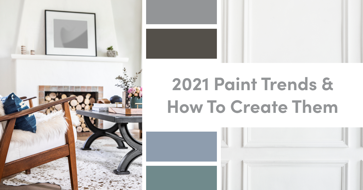
This week’s blog post features the hottest new paint trends for 2021, along with real-life, visual examples of exactly how you can enjoy these new colors in the interior and exterior of your home.
Blissful Blue by Valspar
This calming “Blissful Blue” will help cheer you up as you continue to make your home the center of your world. If you have patio furniture, take this blue and cover your favorite chair in it. Pair it with a yellow pillow, and now your favorite chair doubles as clouds and sunshine for you to daydream on. Enjoy it inside by painting an accent wall. Bonus! It makes for a great zoom background. Not only is this a totally new take on blue, but it also goes perfectly with natural lighting...So pop open a window and enjoy this new color offered by Valspar.
Sap Green by Farrow & Ball
Farrow & Ball’s “Sap Green” is a new color indirect reflection of their connection to nature’s many shades. This shade from Farrow & Ball was created in collaboration with the Natural History Museum. “A true earthy green,” which can be used to create the feel of a lived-in space or for smaller home projects, can wrap the atmosphere with a much richer feel.
If exterior projects are your thing, Sap Green can be used to give that pop of color your front door needs, perfectly complimenting your surrounding landscape. On the flip side, this green can be used to revitalize a guest bathroom. Consider a bathroom cabinet paint upgrade or a full bathroom wall transformation.
Aegean Teal by Benjamin Moore
“Aegean Teal” by Benjamin Moore is a magnificent blend of blue-green and gray, perfect for incorporating a touch of color that is not too bold but makes a statement. Don’t let the name “teal” fool you; the added touch of gray gives this new shade a calming quality that will bring peace into your home. Aegean Teal can bring elegance to any room when used as an accent on trim or cabinetry and is paired well with whites and creams. If you have built-in cabinets that need refreshing, this shade will make them pop! Consider also using it as an accent outside if you have shutters. This color will contrast beautifully against a white or stone exterior.
Tanner's Brown by Farrow & Ball
“Tanner's Brown” by Farrow & Ball comes from the craft of tanning hides and skins to make leather. In a low-lit room, this color can look like a soft black, but outside and in homes with bright lighting, Tanner’s Brown will appear browner, making this shade a versatile choice to transform any area of your house.
Tanner’s Brown would look beautiful as an accent wall in an office or living area to deepen your space, giving it a more modern feel. You could also consider giving your patio furniture a refresh by adding this rich brown shade to your outdoor chairs.
Urbane Bronze by Sherwin-Williams
If you’re looking for a color rooted in nature that captures simple sophistication from every angle, then the Sherwin-Williams 2021 Color of the Year, “Urbane Bronze,” is for you! This new neutral is bold yet understated and pairs nicely with wood finishes, stone accents, and mixed metals. The best part is that Urbane Bronze is such a multifaceted color and can be used as a primary or an accent color.
This warm hue can be implemented indoors as an accent wall to accentuate window trims or even spruce up the appearance of your fireplace mantel. Urbane Bronze isn’t just for interior use. In fact, it looks incredibly sharp as an accent for front doors and exterior trim when paired with whites. The versatility of Sherwin-Williams Urbane Bronze is unmatched, and it’s easy to see why it was chosen to be the 2021 Color of the Year.
Canyon Dusk by Behr
Warm desert tones are brought to life with Behr’s 2021 Color of the Year, "Canyon Dusk." Inspire feelings of togetherness, comfort, and grounding with this tan-pink hue. It’s been used as a way to create a space for relaxation in the bathroom, inspire connectivity in the dining room, or even as a way to accent a blank wall in your home. Pair Canyon Dusk with other natural colors such as browns, greens, blues, or other neutrals like beiges and whites. This color will also pair well with wood tones and white counters.
Passionate of HGTV Home by Sherwin-Williams
"Passionate" is a rich, saturated red that blends modern style and traditional charm. The daring tone joins nine nature-inspired shades in HGTV Home’s Delightful Daring Color Collection, which can be discovered solely at Lowe’s. Passionate’s profound red creates a lively backdrop for neutral furniture and nature-inspired tones.
Use this color in your social spaces like your living room and dining room to create an invigorating feeling. You can also go bold with this deep red on the exterior of your home by using this color to paint your house numbers. Warm and legible for visitors looking to pull into your driveway!
Ultimate Gray and
Illuminating by Pantone
This year PANTONE described their color selections as “a marriage of color conveying a message of strength and hopefulness that is both enduring and uplifting.”PANTONE 17-5104 Ultimate Gray + PANTONE 13-0647 IlluminatingThese two very different colors symbolize the harmony of partnership. “Illuminating” with its hopeful, optimistic hue and “Ultimate Gray” with the reassuring resilience of natural elements.
If DIY isn't your thing
and you need help finding the best painters or home designers in our area, we are here to connect you to the best. Give us a ring or send us a quick email here. We know the best vendors!


.png)

